5 Decorating Mistakes & How To Avoid Them
Who doesn't love the idea of redecorating their homes for a fresh and lively feeling? While there's nothing wrong with honing your creative skills, there are some unforgivable design sins that can instantly spoil your space and come off as a shabby effort on your part.
Designing your indoor spaces can be therapeutic and fun, but the final result depends on how you approach things. Choosing a suitable theme and colors and picking statement furniture can sound overwhelming at times, tending to give us bouts of stress and the much-hated feeling of indecisiveness.
Not everyone has the precision of a polished interior designer, but that doesn't mean we can't brush our skills with continued practice. Please scroll down to find common mistakes that we tend to make when sprucing up our spaces and how not to repeat them in the future.
Frames On The Wall
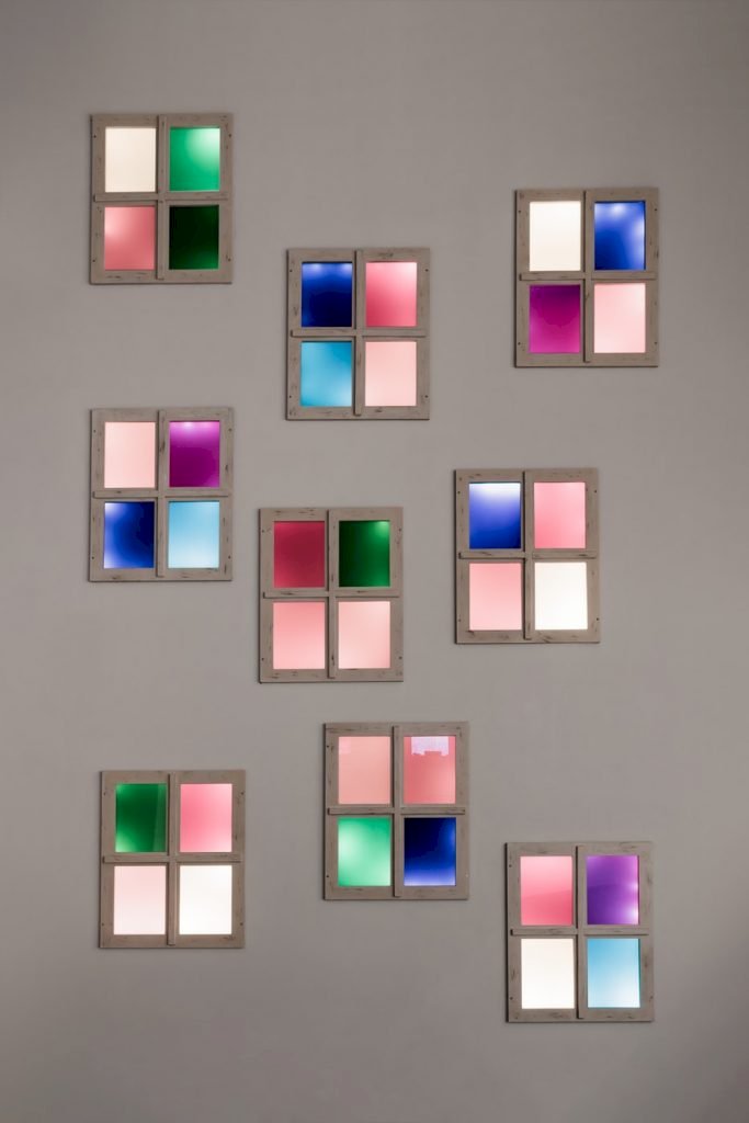
Photo By Paweł Czerwiński On Unsplash
Often, we loathe the idea of having blank, white walls spoiling our homes' look. While most people go for painting their walls to add vibrance and energy, some might consider the idea of adding several frames instead.
Mirrors have a particular purpose to serve, but having too many of them all together looks like a wasted effort. Whether you're aiming for a more orderly pattern or prefer scattered frames, it's best to drop the idea and decorate your walls with graphic art pieces.
Bed Or Furniture Pushed To The Corner
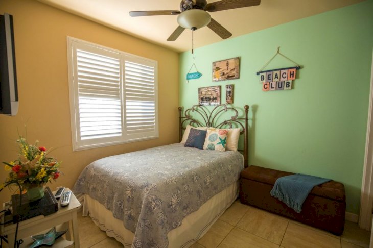
Photo By Jason Leung On Unsplash
Another common home decor error is pushing all the furniture in one corner to make more space. People usually do this to create a symmetrical pattern of arranging their rooms to appear more organized.
Rooms with a corner view appear cluttered and inspire feelings of undue stress and unease. It is better to place the furniture parallel to the walls to clean the room and move around things when needed.
One Side-Table
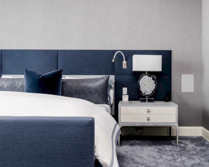
Photo By Chastity Cortijo On Unsplash
Many of us have started getting rid of furniture pieces to create more space for moving around with time. One critical point to remember here is distinguishing between "decluttering" and removing essential furniture items that complete the room.
Having night tables on both sides of the bed is mandatory when considering bedroom decor. If you do away with one table, it can make the other person feel left out as they will have no place to set down their book, phones, or other essential items.
Hotel-Themed Rooms
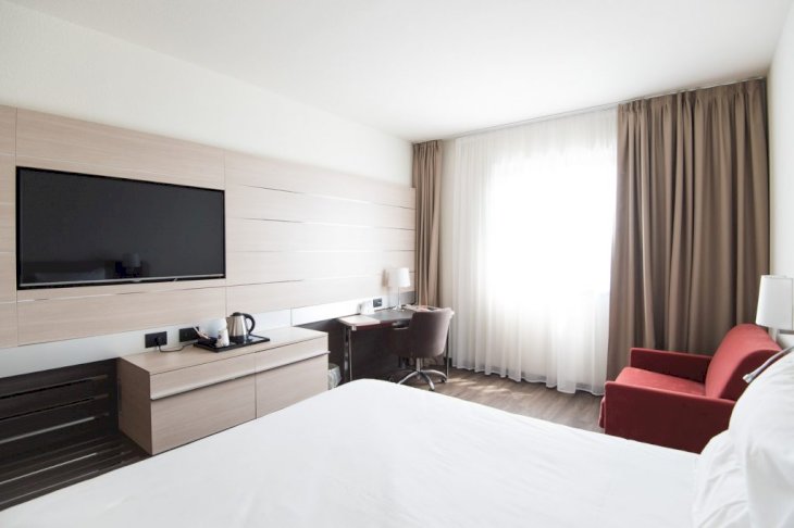
Photo By Paul Postema On Unsplash
It's hard not to fall in love with the contagious aura of hotel rooms. We all love them, and we like staying in rooms that are spacious, organized, airy, and have little to no extra furniture so we can relish in the feel-good vibes.
However, it's a decor crime to want to design your bedrooms with the hotel room "look." Our homes should feel warm, homely, and flexible enough to adjust to our changing moods, and hotel rooms offer none of these things.
Small Area Rugs
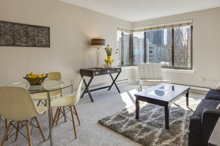
Photo By Francesca Tosolini On Unsplash
Rugs and carpets are considered essential home decoration pieces. Oftentimes, people choose smaller rugs to place underneath their bedroom couch or the dining table in the living room.
Adding small area rugs can come off as an incomplete and hasty effort. Your furniture should be able to sit perfectly on the rug, which adds to its balance and gives a sense of uniformity and style to the room's decor.