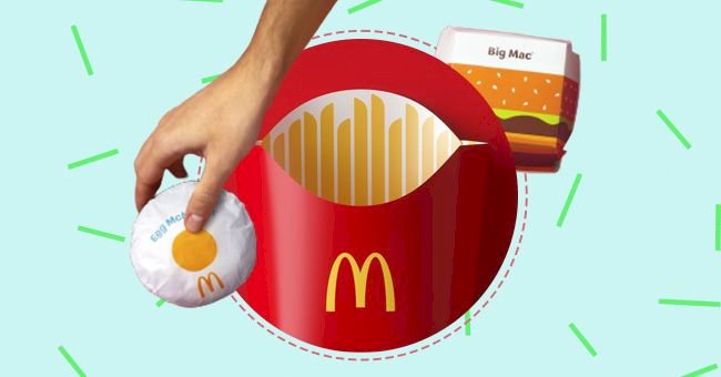
McDonald's Releases New Global Packaging Redesign By Pearl Fisher
The new packaging is a simplified and modern take that highlights McDonald’s playful side using graphic illustrations to cherish the feel-good moments. Each product comes with an easy-to-identify design from the point of assembly to its contact with the customers.
McDonald’s happens to be one of the chosen few global brands that enjoys a widely diverse and loyal customer base. It has been able to stay ahead of its competition because of premium quality food, excellent marketing and one-of-a-kind global branding strategies.
The global food chain has recently embraced a new packaging design for its top favorite menu items, courtesy of Pearl Fisher. To find out which food items will be available in the new packaging and what’s the reason behind the redesigning, let’s delve into more details.
1.The New Global Packaging
McDonald’s has collaborated with Pearlfisher, an independent design body, to redesign its packaging system in a more simplistic and modern manner. The global chain previously used typography and on-pack messaging for the majority of its food menu items.
However, the new package design is decluttered and simple and makes use of interesting graphic illustrations to encapsulate the playful and connective side of McDonald’s. The rather bold and vibrant vector style graphic system triggers a sheer sense of pleasure and ease.
“With over 60 million touchpoints every day, the goal was to make the packaging more connected and evocative of McDonald’s’ playful point-of-view.”
says Pearlfisher.
2.Design Details
Pearlfisher worked diligently to create a unique and all-encompassing framework for the brand’s entire product portfolio. The food items that have been repackaged include Cheeseburger and Quarter Pounder with cheese, Drinks, Fillet-O-Fish, Egg McMuffin, Big Mac, McFlurry and others.
The product wrappers have been designed to highlight the main ingredients for ease of identification by the customers. The fries pack is still colored red and yellow, but the inside now includes pointy fries. The Big Mac box features layers of the burger in an animated, fun style.
The Egg McMuffin wrapper now comes with a huge yellow yolk in the center, while the Cheeseburger features a bold, dripping yellow horizontal line. The Fish-O-Fillet box showcases water waves in a darker and lighter color palette, and our favorite McFlurry now comes with a pink dotted and layered pattern.
3.Recognizable & Modern Redesign Approach
The new packaging system has been designed keeping in mind ease of identification and recognition. The bold graphic illustrations will allow the crew members to recognize the various food items and speed up the operation and assembly procedures in restaurants.
“There’s beauty in the simplicity of McDonald’s’ iconic menu items. We aimed to find the most special, recognizable and iconic expression of each – celebrating them in a way that makes people smile. Everything in this system has a purpose and helps activate McDonald’s’ brand positioning to make delicious, feel-good moments easy for everyone.”
shared Matt Sia, Creative Director at Pearlfisher.
McDonald’s has been known for its uniformity of taste and quality globally. The food chain officials are pretty excited about the redesign system, and are describing it as a “modernized approach that will help highlight the specialness of the menu and McDonald’s commitment to quality.”